This is my third post in this series of posts on ‘Data Mining and Analysis on Twitter’ and here I will be discussing about how one can use the geo-tagged tweets from twitter to identify places of interest, organize great events and reach the maximum amount of customers.
I begin by presenting a very simple analysis of how the geo-tagged tweets from a city can be used to identify some places of interest in the city. Here I will present an example of visualizing tweets in London. These are the geo-tagged tweets collected for one week (16 Aug, 2011 to 22 Aug, 2011) from London (latitude,longitude; (51.3695, -0.3475) to (51.6435, 0.0915)). We plot these tweets as small blue points on a map of London using Geo-Commons . You can try to play around with the map here.
The Figure above shows the visualization for the data collected as per the above setup. We can see from the visualization that there is particularly large density of tweets from a few places. We have identified and marked two of such places on the map. This presents an example of how the tweets and their density in a particular location can be used to identify places of interest and important landmarks at that place.
In addition to the detection of landmarks in cities, we also show through the above example another kind of analysis using the tweet density. The high density of tweets at the Oval cricket ground is as a result of the India vs England cricket match during the week from 18 Aug, 2011 to 22 Aug, 2011 as a result of which there is a high density of tweets from the cricket ground. Hence, one can also discover events that are going on by looking at the data from the tweets as well as the density of tweets at certain places.
Another important information that we can infer from the above visualization of tweets in London is that most of the tweets align with the roads/streets rather than from open grounds.
The next visualization that we present can help us to study the user behaviours at different times. It can give us a clue to where most of the user tweets come from during different times in a day. This information can be used by organisers to plan their events so that they can attract a maximum amount of crowd. The setup for the following experiment consists of tweets collected from London on 18 Aug, 2011 from 00:00h to 23:59h and then aggregated into Greater London Ward Boundaries dataset using Geo-Commons.
We have also tried to plot the geo-tagged tweets on a map based on their time information. By looking at the location of tweets at different points in time over a week, we can observe that the location and density of tweets remains periodic over time and we can see the evolution of tweets as the day progresses. We can also make some simple inferences by using the tweet’s location and time information. E.g. By looking at the information, we can say that there are no tweets from the river during the night as opposed to high density of tweets from the river during day times. Similarly, the number of tweets in the evening is much more than as compared to day time or after midnight.
Now I will show some examples of how to identify important customer groups by tracking keywords on twitter. The following visualizations contain geo-tagged tweets that contain the keywords mentioned above from 27 October, 2011 to 8 Nov, 2011.

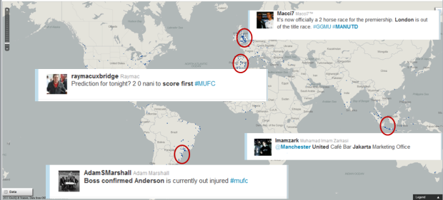
The image above shows the tweets for the topic ‘Manchester United’ in the specified time frame. By looking at the visualization results, we can infer that most of the tweets mentioning Manchester United come from in and around Europe. This can be because of the fact that Manchester United plays in the English Premiere League and has its home ground in Manchester. In addition to this, we also find that there are a lot of tweets from countries whose players play for Manchester United. We also present a few such examples in the visualization where we show a tweet mentioning the player ‘Nani’ coming from Portugal and another tweet mentioning the player ‘Anderson’ from Brazil. In addition to these inferences, we also find that there are a lot of tweets from Indonesia and Malaysia that talk about Manchester United. This is because of the fact that Manchester United has invested a lot in these countries and is therefore very popular.

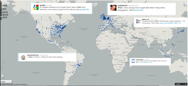
This image on the other hand shows the geo-tagged tweets about the topic ‘Apple Inc.’. We find that as opposed to tweets about Manchester United which were mostly from Europe, Apple has a much larger popularity and tweets about Apple come mostly from North America and Europe. This can be explained as the popularity and usage of products of Apple in these regions.
When we compare the results of Apple and Manchester United, we can see that Apple is more popular than Manchester United as the volume of tweets for Apple is much larger than Manchester United. E.g. For the above setup of two weeks, we obtained more than 32,000 geo-tagged tweets for Apple as opposed to only 1,400 geo-tagged tweets for Manchester United. Another inference that we can draw from the above visualizations is that interests about Apple are spread over the world whereas for Manchester United, the interests are restricted mostly to Europe and few countries in Asia.
All posts in this series:
