This post will present one of the results of my recently concluded project on Data Mining and Analysis on Twitter. Through the project, our aim was to analyse different clustering algorithms to cluster users on twitter based on several similarity measures. In this post, I will present the results and analysis of applying the Fast Modularity Clustering on a group of users that we had collected from twitter. We used several different similarity measures for applying this clustering.
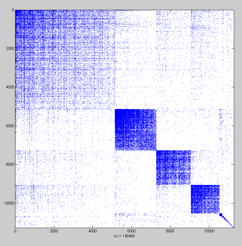
We now consider a group of 11273 users which we collected beginning from a central user in India and then following the followers and friends links. Before I present a description about the clustering of the group of users, let us first take a look at the spy plot of the social connections. The spy plot shows which users have a ‘following’ or ‘being followed’ relationship. Since these users have been collected starting from a central users, these have high connections among them because of the small world nature of the graphs on social networks.

Since we don’t know the number of clusters for the data set beforehand, we cannot apply the spectral clustering algorithm as we did for a small group of users as explained in this post (however, there have been a few researches on obtaining the number of clusters form observing the eigenvalues of different matrices). Therefore, we used an hierarchical clustering algorithm to obtain clusters for this dataset.
there can be certain hierarchical structure in the graph which can be exploited in order to detect communities in graph. The starting point of hierarchical clustering algorithms is a measure of similarity between the nodes in the graph. The hierarchical algorithms are further divided into Agglomerative algorithms and Divisive algorithms.
More specifically, we used the Fast Modularity clustering algorithm. The algorithm uses an agglomerative approach to maximize the modularity of the graph partitioning. Modularity is a property of a network and a specific proposed division of that network into communities. It measures how good a partition is in the sense that there should be many edges within communities and very few between them. I will skip the mathematical details here to keep the post simple.
Let us now analyse the results of the algorithm. The following figure presents the spy plot obtained after rearranging the users based on the communities in which they were placed by our algorithm when applied on the social connections matrix as the input. Note that we order the clusters by the number of users in the cluster with the cluster with the most number of users on the top. We can observe from the plot that the algorithm performs quite well in arranging the users into different clusters. We obtain a modularity value of 0.650112 for the final clustering result shown in the plot which corresponds to a very good community structure between the users.
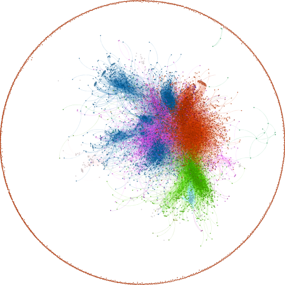
The above figure shows the distribution of these users into different clusters obtained as a result of of applying community detection algorithm using users’ social connections matrix as the only similarity measure between the users. Here, the different colors represent the different clusters. We can observe that most of the nodes in the graph are divided into 4 major communities with other small communities with very few nodes. In fact the top 4 communities in the graph cover more than 93% of the total nodes. These communities are represented by red, green, blue and purple colours in the decreasing order of the nodes that they contain. Note that the positions of different nodes on the visualizations don’t represent any cluster information about them. The positions of the nodes only correspond to a layout. We keep a constant layout for all the different visualizations for this group of users so that it is easy to draw conclusions by looking at the figures. We assign a cluster label of 0, 1, 2 … to the clusters in the increasing order of their size. This (and more to come) visualization(s) of clusters was obtained using Gephi by feeding it with the graph and the clusters obtained by our algorithm.
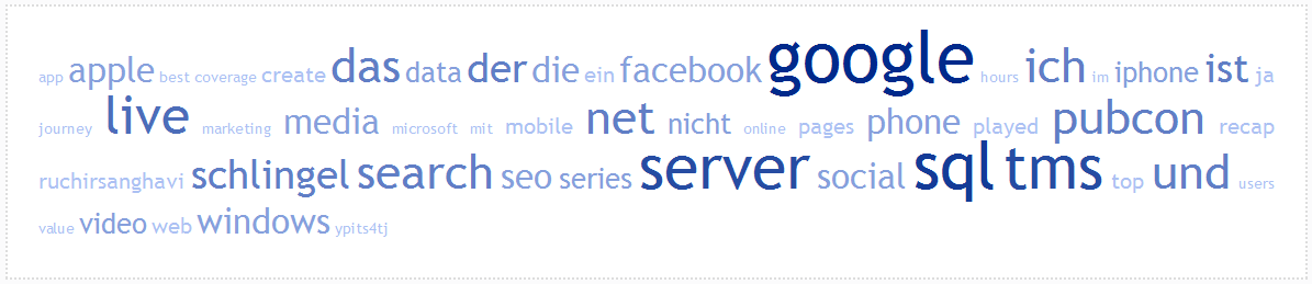
By looking at the clusters detected by our community detection algorithm, we can see several structures and draw inferences from the users in the clusters. E.g. the largest cluster, (i.e. cluster 0) contains most of the users from UK. We also observe that the users are mostly web developers/software developers/computer geeks and talk consistently about these terms. In addition to this, an analysis of other clusters also shows several similarities between the users in the same cluster. E.g. the users in cluster 2 talk mostly about technologies like ‘Google’, ‘server’, ‘SQL’ etc. Above figure shows the tag cloud for the tweets posted by the users from cluster 2. The tag cloud is built using the online service ‘Tag Crowd’ . Note that the common words in English have been ignored while creating the tag cloud. The tag cloud shows the common keywords in a larger font size. Hence, we can see that most of the words that are very frequently used in the tweets are similar and are related to technology.
If we look at the users in cluster labelled 4, we can see that most of the users are from the same university in India, ‘International Institute of Information Technology, Hyderabad’. Similarly, most users of cluster labelled 6 follow football. Most of the users that have been placed in the cluster are fans of Juventus Football Club .We can observe this through the description of a few users and the tag cloud of their tweets as shown in following figures.


We now present results of community detection for the groups in order to visualize an evolution of clusters in different weeks of data. Since connections of the users remain more or less consistent throughout different weeks, we use other similarity measures in order to divide the users into different communities. Our distribution would be mainly based on the tweets that the users post on twitter. Therefore, we consider three similarity measures (in addition to the social connections) that can be obtained by analysing the tweets that users post on twitter. We use the tweet content similarity, user mentions as well as the hash tag similarity between the users in order to divide them into different clusters for weekly data. Note that there are several users who don’t tweet very often. E.g. For our data set, we find that only 10-20% of the total users tweeted during the one month of data that we analyse here. Therefore, there are several users for whom we don’t have any temporal information and therefore it is difficult to apply clustering based on only that information (as there will be several disconnected components in the network). We therefore take social connections into account when applying community detection on weekly data.
 b
b  c
c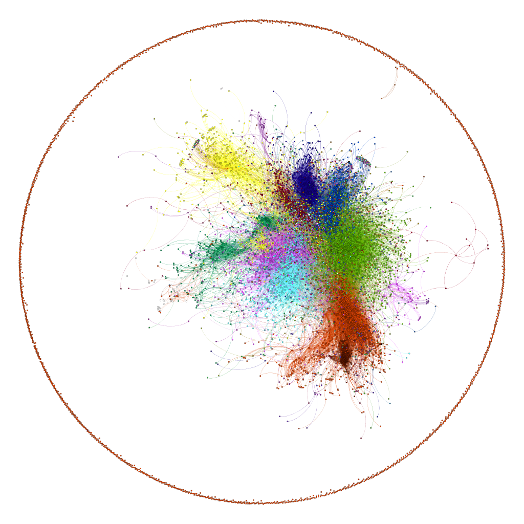 d
d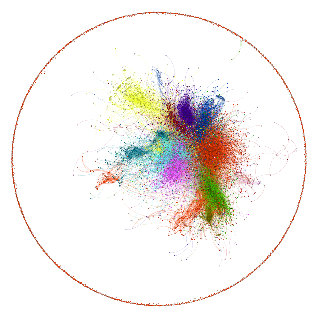
We now present three additional visualizations with similar experimental settings for different weeks of data. (b) shows the communities obtained using data for the week from 2nd November, 2011 to 8th November 2011 whereas (c) and (d) show communities for 9th November 2011 to 16th November 2011 and 17th November 2011 to 23rd November 2011 respectively. The colour scheme remains the same with the colours assigned according to the size of the communities. While transitioning from week 1 to week 2, we can clearly observe that how two communities (red and blue in (a)) merged together to form one cluster in the 2nd week but again split to their original configuration in the 3rd week. We can observe some similar movements in the next three weeks but this time between smaller communities.
We can also compare these results with the visualization from the clustering results for users’ social connections from our first visualization (for clusters obtained on users social connection matrix). We can see that the clustering on social connections lead to formation of a cluster (as shown in blue colour in first image) which was identified as a combination of several small clusters as a result of applying the same algorithm after employing temporal information along with social connections. This means that the temporal information allowed us to make distinction between a group of users which were not very tightly connected or who weren’t interested in similar topics. We can also see that the division of the big cluster (in blue in first image) into smaller clusters (in different colours in above images) remains consistent throughout the weekly results meaning that the division was not a result of temporary fluctuations in the interests of the users and indeed points to a logical division of users into different communities.
All posts in this series: